Design Today

Design Today

Design Today featuring great design, architecture, fashion, graphics and innovation from across the globe.


Hotel New Grand Ready-to-eat Meals

This product is a ready-to-eat meals package design for the only classic hotel in Yokohama. They wanted to convey the tradition and prestige of the hotel with a little wit to entertain those who saw this design. With a design based on the motif of a stockpot, this product brings the flavors of the finest dishes prepared by top chefs working in hotel kitchens to the comfort of your home. Enjoy the authentic texture of slowly simmered curry and soup whose aroma has been fully preserved.

Continue reading


Primary Residence

Primary Residence is an alphabet design that represents abstract architectural forms in typography with three primary colors: red, blue, and yellow. The inspiration originally came from the Bauhaus movement. That was also inspired by the design of stairs and windows from different parts of the world. Each letter and number represents a small part of the buildings without any apparent entry or existence. The stairs, windows, and geometric shapes are dedicated to the Bauhaus architectural style and minimalism, with the primary goal of blending the form and identities of the structure together.

Continue reading


The Soloist

The Soloist Chinese Tea blends traditional Chinese culture and modern aesthetics. Through the ingenious combination of form and meaning, it creates a unique packaging style which impresses the audience deeply. Seven true flavors from the mountains and nature can bring you into a peaceful world in a moment. The unique visual impression and high-quality material experience fully meet the buyers' pursuit.

Continue reading


Pepsi Culture Can Series

Think globally. Act locally. That is the mantra for the Pepsi Culture Can Series. This limited-edition packaging initiative realized unique, hyperlocal designs for markets all across the globe. This series was activated in over 10 countries and expressed through more than 40 unique designs. Our identity, pride, and sense of community were stronger than ever in 2019. The Pepsi Culture Can Series is a global platform designed around those things that bind us together.

Continue reading


No48

The Omecara studio has defined a shape that evokes polished amber or a pebble found on the seashore, thus breaking with the traditional image of ambergris. The shape was designed to evoke solid and liquid, land and sea. The identity is characterized by the number 48, a lettering where the masculine square 4 and the feminine rounded 8 complement each other. The typographic treatment gives an impression of restful lightness, while the gold-colored hot stamping, in the same shade as the perfume, associates container and content. A subtle play of opposites and duality.

Continue reading


Buddy

The new design of the Buddy Workwear Manufacture brand creates a fresh, clear appearance. The dark blue presents as the core color the products, letting the colors and photos work. The light blue is the accent and at the same time highlight color of the design. Both colors harmonies around the products, they complement each other like buddies. The new brand name is the core of the new identity: Buddy expresses the new attitude just by reading it. In the design and wording, buddy comes to life: clear, striking colors and straight typography.

Continue reading


World's best designers, artists and architects.

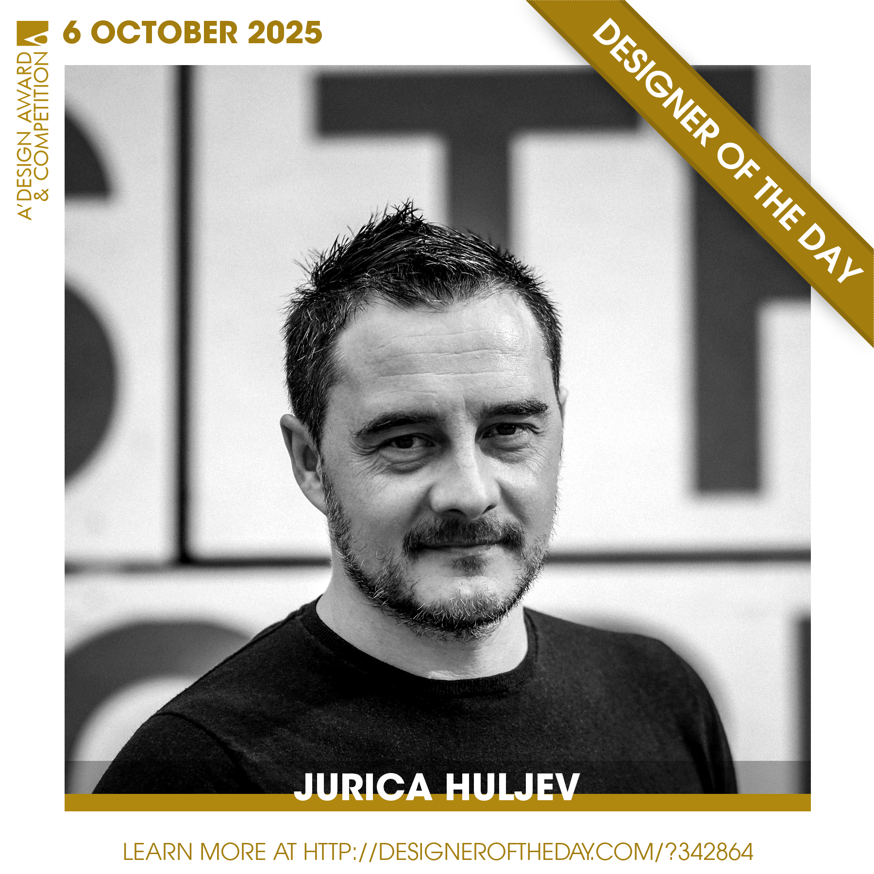
Good design deserves great recognition. Everyday, we are pleased to feature amazing designers who create original and innovative designs, amazing architecture, stylish fashion and creative graphics. Today, we are presenting you one of the World’s greatest designers. Checkout an award-winning design portfolio today and get your daily design inspiration.

Continue reading