Design Today

Design Today

Design Today featuring great design, architecture, fashion, graphics and innovation from across the globe.


No48

The Omecara studio has defined a shape that evokes polished amber or a pebble found on the seashore, thus breaking with the traditional image of ambergris. The shape was designed to evoke solid and liquid, land and sea. The identity is characterized by the number 48, a lettering where the masculine square 4 and the feminine rounded 8 complement each other. The typographic treatment gives an impression of restful lightness, while the gold-colored hot stamping, in the same shade as the perfume, associates container and content. A subtle play of opposites and duality.

Continue reading


Buddy

The new design of the Buddy Workwear Manufacture brand creates a fresh, clear appearance. The dark blue presents as the core color the products, letting the colors and photos work. The light blue is the accent and at the same time highlight color of the design. Both colors harmonies around the products, they complement each other like buddies. The new brand name is the core of the new identity: Buddy expresses the new attitude just by reading it. In the design and wording, buddy comes to life: clear, striking colors and straight typography.

Continue reading


Lowen

Based on the imagination of form and romance, the package design of Lowen series features its unique sense of fashion and evocative expressiveness. It integrates pen drawing, mezzotint art and street tattoo. Different geometrical sharps go with multiple bright colors on the bottle standing for different flavors, including raspberry, cherry and Weissbier. The packing has clear transmission of socializing and flavors, which can help build close connections with target consumers.

Continue reading


Bank of England

Designing for a central bank means finding a balance between technical and sensitive information, staff-led outputs, engaging general communications, and a series of regulations. This is not simple to achieve and it is based on delicate internal dynamics. The new identity has been developed together with the people who will use it, balancing all the aspects of the communications. It focuses on reaching a wider public with an accessible, relevant, structured, and distinctive approach. These key principles have been used as a design direction for all the visual assets.

Continue reading


Shenzhen Jiangangshan Hill Park

Henri Rousseau's impressionist style is ingeniously applied as the main visual elements into this project. Wayfinding signs are designed as interesting impressionist-illustration silhouettes here and there in the park, creating a tranquil eco-friendly hilly aura for visitors. The artist's thoughts and the project's purposes are brought into resonance by the concept of harmony between human and nature.

Continue reading


Moscow Ambassadors School

Interesting stories are hidden behind every turn of the old streets and it is impossible to associate the City with any one minimal set of recognizable symbols. While studying the city, the future ambassador discovers it anew, like a student discovers a primer at school. For the construction of the identity, a typographic solution was chosen, based on the principle of typographic eclecticism: the Old National script, interspersed with the cursive script and recognizable fonts of the avant-garde artists. The color scheme is laconic-bright red.

Continue reading


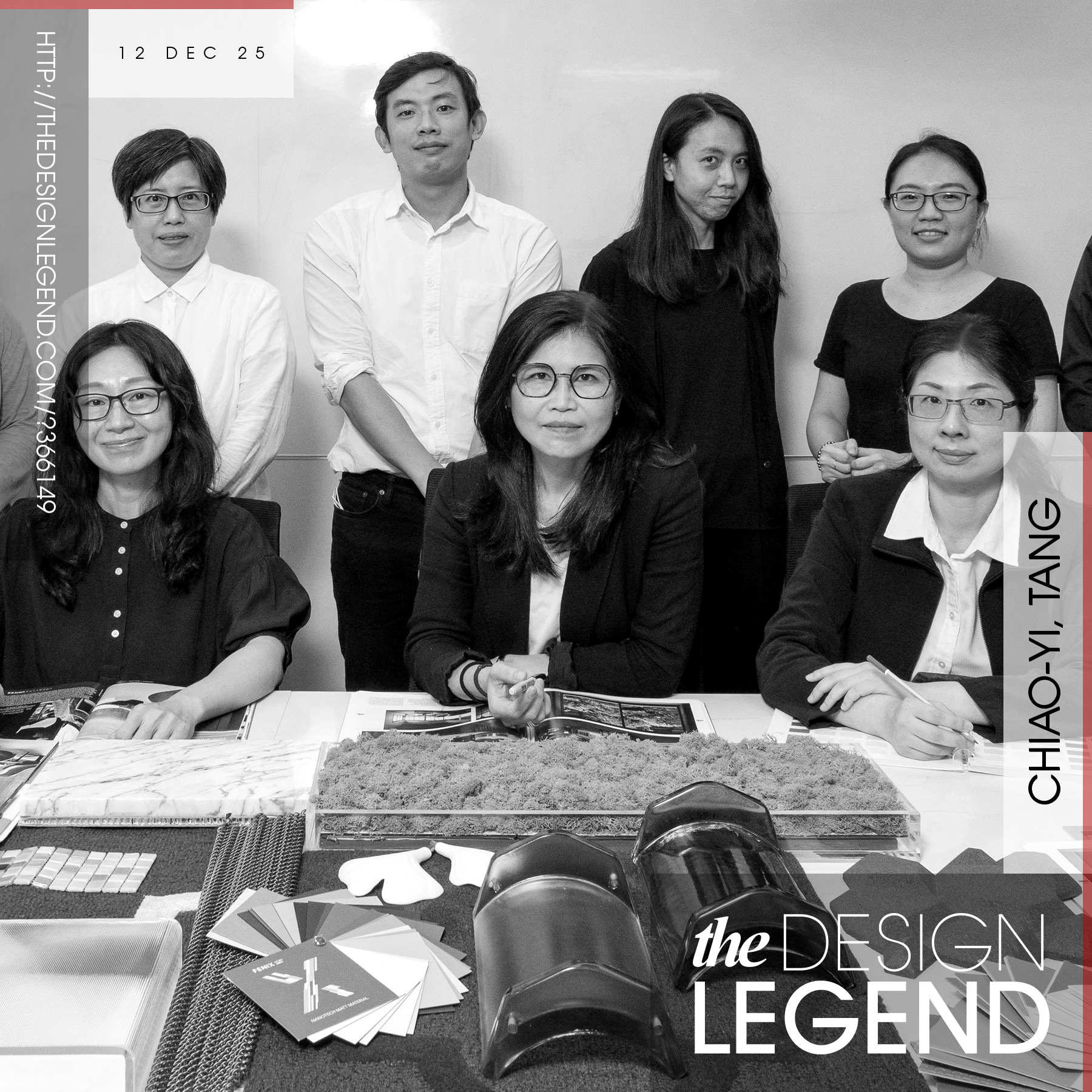
Legendary designers and their award-winning works.

Design Legends are extremely famous designers who make our World a better place with their good designs. Discover legendary designers and their innovative product designs, original art works, creative architecture, outstanding fashion designs and design strategies. Enjoy and explore original design works of award-winning designers, artists, architects, innovators and brands worldwide. Get inspired by creative designs.

Continue reading