Design Today

Design Today

Design Today featuring great design, architecture, fashion, graphics and innovation from across the globe.


Buddy

The new design of the Buddy Workwear Manufacture brand creates a fresh, clear appearance. The dark blue presents as the core color the products, letting the colors and photos work. The light blue is the accent and at the same time highlight color of the design. Both colors harmonies around the products, they complement each other like buddies. The new brand name is the core of the new identity: Buddy expresses the new attitude just by reading it. In the design and wording, buddy comes to life: clear, striking colors and straight typography.

Continue reading
 

Lowen

Based on the imagination of form and romance, the package design of Lowen series features its unique sense of fashion and evocative expressiveness. It integrates pen drawing, mezzotint art and street tattoo. Different geometrical sharps go with multiple bright colors on the bottle standing for different flavors, including raspberry, cherry and Weissbier. The packing has clear transmission of socializing and flavors, which can help build close connections with target consumers.

Continue reading


Bank of England

Designing for a central bank means finding a balance between technical and sensitive information, staff-led outputs, engaging general communications, and a series of regulations. This is not simple to achieve and it is based on delicate internal dynamics. The new identity has been developed together with the people who will use it, balancing all the aspects of the communications. It focuses on reaching a wider public with an accessible, relevant, structured, and distinctive approach. These key principles have been used as a design direction for all the visual assets.

Continue reading


Shenzhen Jiangangshan Hill Park

Henri Rousseau's impressionist style is ingeniously applied as the main visual elements into this project. Wayfinding signs are designed as interesting impressionist-illustration silhouettes here and there in the park, creating a tranquil eco-friendly hilly aura for visitors. The artist's thoughts and the project's purposes are brought into resonance by the concept of harmony between human and nature.

Continue reading


Moscow Ambassadors School

Interesting stories are hidden behind every turn of the old streets and it is impossible to associate the City with any one minimal set of recognizable symbols. While studying the city, the future ambassador discovers it anew, like a student discovers a primer at school. For the construction of the identity, a typographic solution was chosen, based on the principle of typographic eclecticism: the Old National script, interspersed with the cursive script and recognizable fonts of the avant-garde artists. The color scheme is laconic-bright red.

Continue reading


Q Shinsyu Apple Pie Lab

These are branding projects for Q, an apple pie specialty store. The typography of the store's name, Q, was created using the apple as a motif and symbol for the store. All brand tools, including the exterior, interior, lighting, stools, uniforms, and packaging, were designed using this simple symbol. In keeping with the product concept of utilizing materials as they are, the tools are also designed simply, utilizing the colors and textures of the materials, such as paper and wood, as they are. All designs are in line with the store's vision of valuing the original taste of apples.

Continue reading


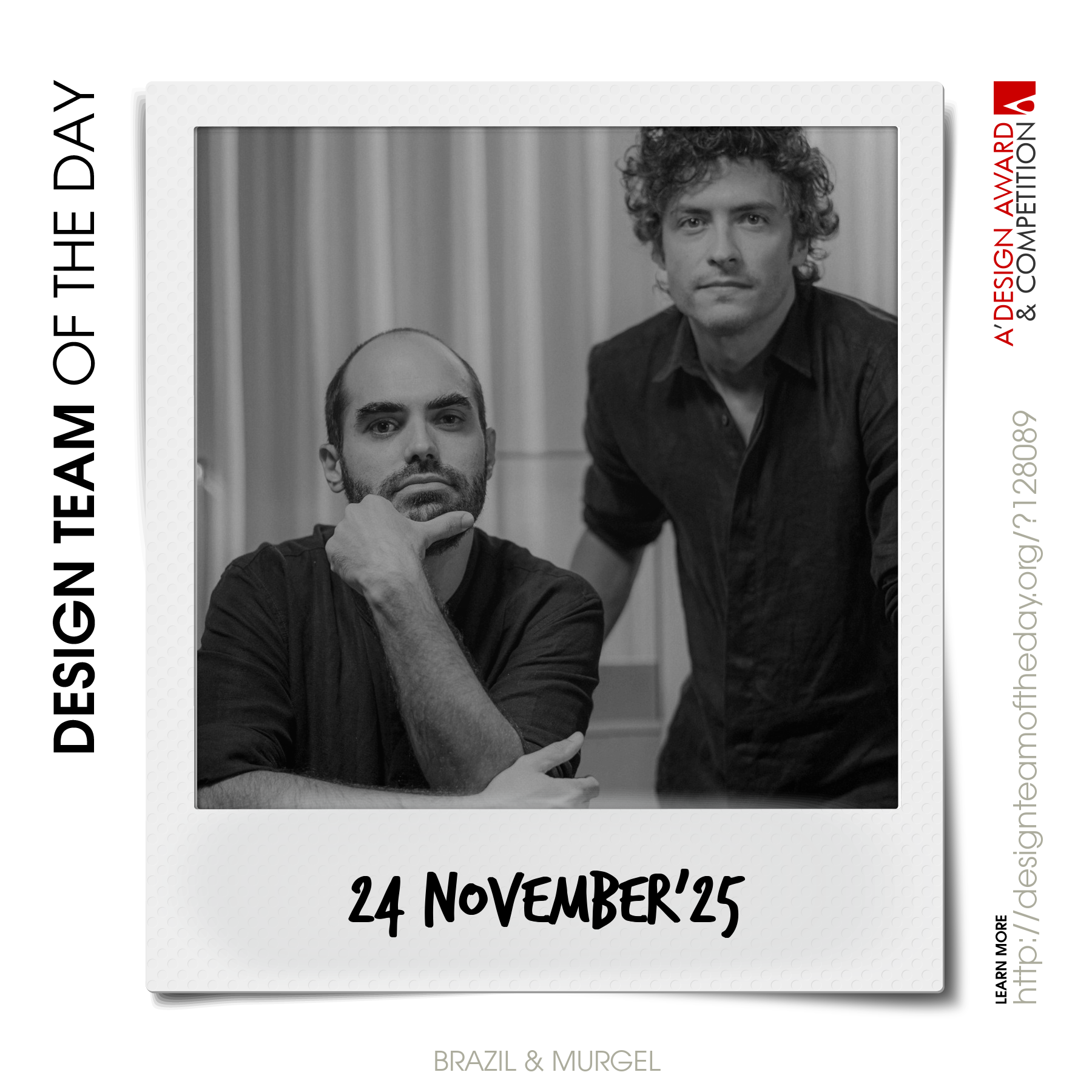
World's greatest design teams.

Sometimes you need a very big team of talented designers to come up with truly great designs. Everyday, we feature a distinct award-winning innovative and creative design team. Explore and discover original and creative architecture, good design, fashion, graphics design and design strategy projects from design teams worldwide. Get inspired by the original works by grand master designers.

Continue reading